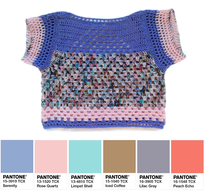
COLOR. It’s everywhere, and when it comes to fashion, it’s front & center! Every color we wear allows us to express and compliment our personal sense of style. The right color can compliment our hair, skin & eye tones. It can make a bold statement, or blend naturally into its environment. The wrong color, however can make us look washed-out or even decrease the perceived value of a garment.
What colors are the right colors though?! The answer to this question is different for everyone, but one of the our favorite sources to draw inspiration from has always been the PANTONE Color Report of the year. PANTONE has been leading the world of fashion on a color journey for years, and they seem to have an constantly impeccable eye for color.
Here’s a glimpse into the Spring 2016 PANTONE Color Report pallet to help you begin your spring & summer wardrobe:

Our initial thoughts upon the Color Report reveal were how “wearable” the colors are this year! Each color has a very specific tone to it that seems to compliment a wide variety of complexions. As the Executive Director of the PANTONE Color Institute reports herself:
“Colors this season transport us to a happier, sunnier place where we feel free to express a wittier version of our real selves.”
– Leatrice Eiseman
It’s easy to agree that this years pallet is very enlightening & full of inspiration!
Following the rising appearance of festival inspired looks, these fun colors seem to be a reflection of the joy found in the warmer seasons, provoking celebration. Here are some looks put together by Kandichet Crocheted Apparel featuring some of this season’s colors.


For every Color Report PANTONE also chooses a Color of the Year. This year it was very surprising to see two colors were chosen!

These two whimsical, natural, & very flattering colors are no doubt going to be spotted in everyone’s collection this year.


